

USER EXPERIENCE DESIGN + BRANDING EXPLORATION
SPRUCE
We’ve all had a gross roommate or two. Or three. The Spruce app is designed to help college students living off campus organize their cleaning tasks, while preventing roommate conflict.
This is a common problem that myself and many of my peers struggle to navigate. I was able to draw upon this personal experience, to develop an intuitive user interface that prioritizes simplicity, and doesn’t create another chore.
My second goal for this project was to create a brand identity for Spruce. Many fantastic products never have their moment in the sun because they don’t understand what sets them apart. With this in mind, I wanted to explore how to define an identity in the digital space.
01
USER RESEARCH
How can an app minimize conflict caused by cleaning schedule challenges in college living situations?
01

A VALUE BASED APPROACH
After my team conducted user research, we narrowed down three values that were key to our process: Transparency, Respect, Accountability.
Reflecting on those values helps me create an emotional connection to the problem, and are key phrases that are there to reinforce the intention of the project.
02
FIRST UX ITERATION
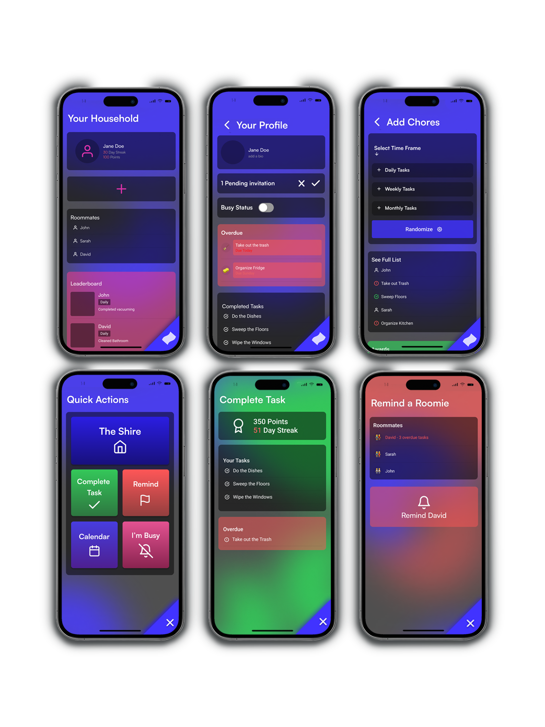
Reflecting on the user research, I developed a user experience that emphasized positive reinforcement and efficiency, while creating subtle social pressure.
Leading with transparency and accountability, you are able to see everyone’s assigned tasks as well as a group leaderboard. Just the idea that someone else can view your activity on the app encourages task completion.

03
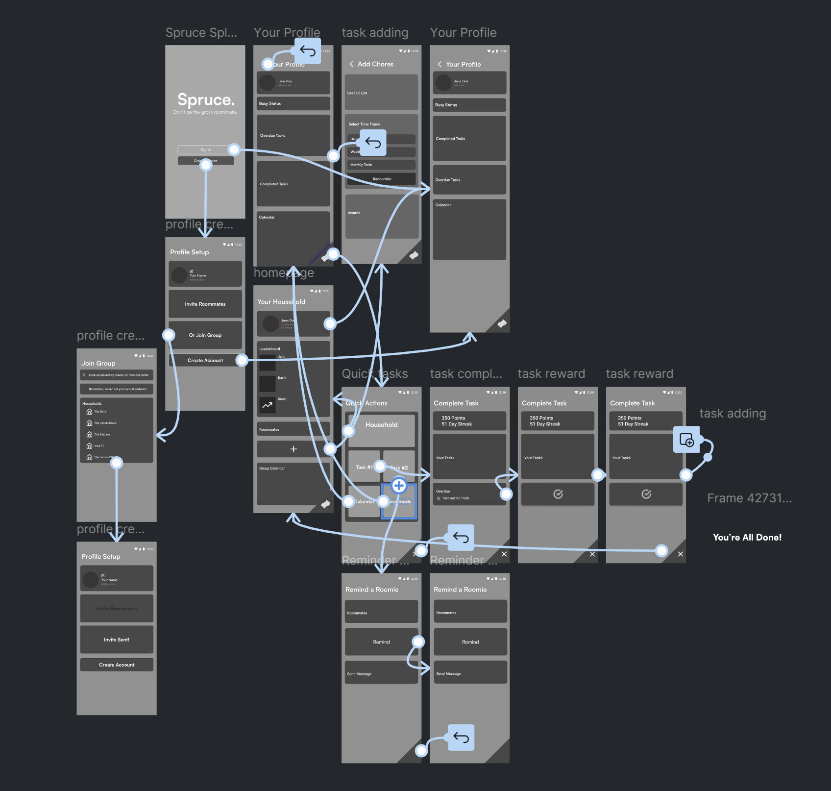
FLOW IMPROVEMENTS
Using the key features I developed in the first iteration, I created a low fidelity prototype to explore the user flows.
Always fixed to the corner of the screen, the quick action bar makes completing tasks effortless, to prevent additional hassle.
Allows for daily, weekly, and monthly time frames. For fairness and transparency, chores are assigned on a rotating and random basis. No, you won’t get stuck taking out the trash every week.
QUICK ACTION MENU
TASK ADDING FEATURE
04

BRANDING
It was an exciting challenge to design a project that appeals to college students.
We spend a lot of time on our phones, and have a high level of discernment within our digital spaces. So, I connected back to the idea of transparency, and the tagline reflects that same honest tone.


TYPOGRAPHY AND GRAPHIC DESIGN
For Spruce, I developed a simple and memorable logo. Since Quizlet and Duolingo were the frequently used apps of my user persona, I referenced those as precents.
I chose an electric indigo/purple as the primary color. The electric indigo is close to blue to create feelings of cleanliness, while having a more youthful energy.
Lastly, I went with a no frills Sans-Serif font Satoshi. Clean, modern, and easily legible.

05
PUTTING IT ALL TOGETHER
To bring the project to a high fidelity level, I applied the branding to the original user experience design that I made, and improved the prototype to have a less complicated user flow. In the future I hope to expand the feature offerings and explore opportunities for user customization of the layout.